How to Choose a Font for Your Brand: a Step-By-Step Guide
Any designer would agree that choosing a font for a brand is one of the most important steps. First, you have to pick a product that perfectly conveys the mood of the business. Secondly, it should speak for you. And thirdly, this item should be easy to read and understand. Perfect typography is one of the most difficult things in creating a logo, which is directly related to corporate identity. There are thousands of creative fonts available online, among which you may get lost. In fact, all of them have a unique design, high quality and often multi-purpose base. And if you do not know how to find the most suitable solution, we have prepared for you a guide that will simplify the process of choice. The main thing is to understand the individuality of the project, analyze it, use the tips and choose the product that best conveys the appropriate qualities of your business.
Typeface and Branding: What Is Important to Know
There are over half a million fonts in the world. Although much of the web is built on a few popular types of scripts, there are many opportunities to choose a unique way. As fonts are also visual elements, you may use them as psychological elements.
Choosing a script is not an easy task. In fact, it can take months or years of trial and error with constant experimentation, and even the smallest changes can increase or decrease the success of your project.
We must remember that in today’s world, a designer is left with limited means of expression. Illustrations are not always appropriate, patterns also seem out of place, and there is often no space for a logo.
A good brand font helps maintain consistency between different mediums as well as brand personality.
The typeface, acting as an element of the stylistics of the firm, has a strong association with the brand products being sold. Customers form an opinion about the company as a whole with the help of distinctive features of the lettering style used. When they see the font, they automatically think about the project, company or movie. Let’s take for example the Harry Potter script. If you see it somewhere that is not related to the movie or the book, you will immediately have an association with this series of novels.
Plus, after a number of studies in psychology it was found that the script can affect the mood of the person who sees it directly. Even the same words have a different emotional coloring, based on the typeface style in which they are written.
Therefore, it is very important to consider the peculiarities of potential buyers and to choose a typeface that will be positively and effectively perceived by clients. Light playful letters on the advertising sign will actively accommodate the children’s audience, but to attract business partners, this style is inappropriate. If you use a more standard typefaces it will also be boring, because everyone is accustomed to them. Therefore, you need to be careful with this choice.
What Fonts Are: Common Classifications
The main official classification system today is the Vox-ATypI system, which was originally created in 1954 by Maximilien Vox. But already in 1962 it was adopted by ATypI. It was slightly amended by the Association to divide all typefaces into 11 basic categories with a further division within each individual type.
The British standards for lettering classification, adopted in 1967, are also based on the Vox classification. In comparison to the last one, they are somewhat simplified and have remained unchanged since their origin.
Therefore, it would be purposeful to combine several different systematization techniques in order to consider as many font types as possible. In this way, you will be free to decide which category you will be more satisfied to work with.
Serif Fonts
A serif is usually a vertical stroke that begins and ends a letter. The serif is one of the most natural ways to bring a stroke together smoothly and at the same time give a clear ending. It was also the first typographic script with serifs. The edges almost touched each other in printed editions, as if uniting the letters into a single word. The classic typeface of printing houses involves the use of serifs. They come in different types and styles. They include rectangular, elliptical, triangular, oval and so on.
Venetian Antiqua (Humanist)
During the Renaissance, Italian cultural centers revived antiquity. This was reflected in typography. Its characteristic features are calligraphy and a distinctive manner of handwriting. The proportions of the characters are quite broad and the serifs are a little bit flattened. As a rule, these fonts have a shallow height of lowercase and a small contrast between the main and connective strokes.
Some examples are: Guardi, Arno, Adobe Jenson.
Old Style Italian-French Antiqua (Haralds)
Part of the old style antiqua, it turns out much closer to modern typefaces than humanist typefaces. The heralds are less calligraphic, as the printed letters are gradually no longer seen as imitations of handwriting. The serifs are longer and sharper and the characters are more proportional.
Some examples are Sabon, Galliard, Janson.
Antique Baroque
This typeface is also called transitional or realism fonts. It is distinguished by a combination of the old style, typical for broad stylistic fonts, and the elements of the new style. There is no calligraphic influence and the serifs are smoother. The elements of script get more and more refined forms.
Some examples are Clearface, Joanna, Melior.
Antique of the New Style
Ironically, the typefaces which we call the new style antique first appeared in the second half of the 18th century. The main strokes of it are very contrasting, the connecting ones have minimal thickness. The serifs are long and thin compared to other styles. Taken together, these characteristics create a very difficult to read visual appearance, and the antiquas of the new style do not work well with large amounts of text. Rather, they are great for big lettering, such as headlines or eye-catching texts, as these characteristics emphasize the elegance of the appearance of the letters.
Some examples are New Caledonia, Bodoni, Aviano, Walbaum.
Stab Serif
This typeface is the easiest to distinguish from the others because of its unique appearance. The font was originally created for advertising purposes, posters and display on large media in the early 19th century. The typical features are strong rectangular serifs without roundings. It can also be observed with little or no contrast between the main and connective strokes.
Stab serif fonts look lighter and more reader-friendly than some variants of the new serif grotesques.
Some examples are Belizio, Sentinel, Clarendon.
Sans Serif Fonts

The earliest sans serif letters date back to ancient Greece. It was embossed and then carefully inked so that it could be read visually as well. At first glance sans serif typefaces cannot be classified in the same way as serif ones, yet these scripts have quite a few features and in the British classification are divided into four categories.
Old Grotesques
Old grotesques cover the early chopped scripts developed in the 19th century. Many of these fonts have only uppercase letters and some are still in use today. These styles are usually very distinctive, with varying saturation around the characters and irregular curves. A distinctive feature of the old grotesques is the roundness of some of the letters, such as the “R”. The thickness of the strokes is usually slightly different, but not enough to affect the calligraphy or pattern.
Some examples are Monotype Grotesque, Franklin Gothic.
Neo Grotesque
This typeface includes many of the most common sans serif fonts. The scripts have evolved from the old Grotesque typefaces and have lost many of their characteristics. In particular, these are typically closed single-width fonts with almost no contrast with the single-frequency construction of the letter “g”.
Created with an emphasis on neutrality and simplicity, they were extremely popular among modernists and remain popular today. Despite the many claims that simplicity leads to illegibility for body text, this is not the case.
Some examples are Helvetica, Bell Gothic, Bell Centennial.
Humanist Sans Serif
The main characteristic of Humanist both with and without serifs is the strong calligraphic influence, basing its forms on the origin of the pen or brush. It means a high contrast of strokes. Most of these fonts have true italic styles.
Some examples are Gill Sans, Frutiger, Myriad, Trebuchet.
Geometric Sans
Instead of neo-grotesques taking their inspiration from old vintage chopped fonts or humanistic grotesques, from calligraphy and engraved forms. This type is built on the simplest geometric shapes. These may be squares or triangles.
Some examples are Futura, Kabel, Avant Garde.
Calligraphic Fonts

These are very attractive and beautiful handwritten fonts. Here, in principle, the point is clear. Calligraphic scripts pretty much speak for themselves and now we will introduce you to some subtypes.
Handwritten Fonts
These are typefaces that imitate someone’s handwriting or calligraphic style. Handwritten scripts are divided based on the writing tool into fonts that imitate writing with a broad-nib or sharp-pointed nib, brush and other tools. Such items are used for posters, title pages, etc.
Some examples are Snell Roundhand, Ashley Script.
Glyptal Fonts
Many of these scripts may be classified as serif fonts, but they mimic the process of cutting letters out of metal or other hard material. Often these items contain only uppercase letters, the serifs are usually small and show a characteristic of hammering rather than a design feature.
Some examples are Trajan, Friz Quadrata.
Display Fonts
These are scripts used for typesetting cover pages, labels, posters, banners and such. It includes elements with shadow, gravure and manuscript. For the most part, this typeface is easy to read, but there are variants with rather tricky works.
Some examples are Algerian, Banco, Broadway.
Blackletter Lettering
It is the name of the typescripts imitating medieval handwriting with a pen. The letters are characterized, as a rule, by narrow proportions, strong contrast, broken strokes, great richness and high decorative effect.
Some examples are Cambridge, Glaive, Karson.
Gaelic Script
This type of script comes from medieval manuscripts. Today it is used mainly for decorative purposes. Examples include newspaper headlines, book covers, print postcards, advertisements, and banners.
Some examples are The Shire, Celtic, Erin.
Which Designs are Best to Do And With Which Fonts?
Sans serif fonts are perfect for any brand that wants their design to be innovative, bold, and sophisticated. This would suit:
- IT companies,
- fashion industry,
- startups.
Serif fonts are great for traditional brands that can establish themselves in a new way. For example:
- financial companies,
- law firms,
- insurance companies,
- consulting agencies.
Handwritten fonts will be the perfect solution for businesses that seek an elegant and personalized approach to their projects. It could refer to the following:
- food products,
- baby goods,
- cosmetology,
- beauty salons, etc.
The Relationship Between Fonts and Reader Emotion
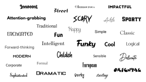
Scientists have said many times that typeface style affects people’s emotions. Knowing these subtleties will bring you closer to finding the perfect script, because you will know what emotions this or that font will evoke.
Straight, elongated typeface
It acts as a universal option for all types of companies, regardless of the products the organization offers to its customers. It is important to consider that this font is not suitable for the creation of goods advertising, if its purpose is to highlight products from similar counterparts of competitors. In this case, the final text will look unsightly. However, colorful elements can be added to the logo to make it more memorable for clients.
Strict square typeface
Most often this style is used in the design of advertising signs for industrial products, as well as for various technological products and posters of a social character. The use of a square austere font will emphasize the importance of the transmitted information and set people up for a serious perception of the meaning of advertising.
Rounded typeface
This form of letters can evoke a sense of comfort and warmth. Scripts that are characterized by angularity, by contrast, seem to be too austere for a person. The lettering style, dominated by roundness, is perceived by potential clients as an indicator of the company’s care and kindness.
Inclined typeface with vignettes
It is usually used in advertising products aimed at a female audience. This style of font is notable for its lightness and beauty, causing pleasant associations. The specified style of lettering can be found in the signs of beauty salons, as well as stores of women’s clothing and cosmetic goods. The use of italics makes the text even easier to read.
Handwritten typeface
It is inadvisable to use this font type in street advertising, because with the presence of larger letters it is difficult to read. But at the same time, it is effective to use the handwritten style in the development of advertising of goods and services, seeking to emphasize their exclusivity and originality.
Stylized decorative typeface
This script resembles Gothic inscriptions by its outlines. It is advisable to use it only if it is appropriate. It will look great on the signs of themed restaurants and bars.
Top 10 Must-Have Tips for Choosing a Font
Match the direction of the business
Choose the most appropriate font that will fit your project perfectly. Using fancy decorative solutions for a financial company sign is not smart. It will look silly and inappropriate. Analyze your business, the audience, take a look at examples from your competitors. After that you will be able to understand what product will suit your business uniquely.
Fully readable
This point is directly related to the first. The more scribbles and incomprehensible characters, the worse the font is readable. Try to reduce the text logo and see if it is a sufficiently legible font. If your answer is yes, then the typeface is suitable.
Harmonization with other elements
Very often we encounter the following situation. There is a picture on the logo and a huge bold font that does not fit the picture in any way. Such a product can cause disgust and show you from an unprofessional side.
Do not go overboard
If you find not one, but several effective scripts, that is fine. But for a brand, it is better to choose one typeface that will be associated specifically with you. At the very least, two fonts will be appropriate. But still, by today’s standards, it is too much. Also, be aware of the flashiness of the typeface. Delicate, fragile, floral lettering is usually too subtle to reproduce at smaller sizes and probably will not be readable. So, opt for a simpler, more prominent item.
Do not base it on personal preference
This is one very important point. It is easy to get confused by interesting options when looking at fonts, but do not let personal preference interfere. After all, the product that you think is beautiful, stylish and attractive may not be useful or appropriate for the project you are working with.
Business mood
Remember, the typeface that most perfectly embodies your brand image will have a huge impact on the minds of the customers and can become iconic if done right. So, it is worth thinking about what kind of mood your business carries.
Do not copy your competitors
You probably always want to be aware of what the competitors are doing. But do not copy their style. It is better to learn from their mistakes and do things at times better. At the very least, that is the correct thing to do. So, definitely do not use the same fonts as your competitors.
Be original
Choose a unique and original font, which will belong exactly to your company. Do not choose standard and simple variants. It is better to bother and spend more than a day looking for one, rather than take the first one you see. It is a good idea to buy a script for your logo from a font store website, rather than choosing a product from the public domain.
Be timeless
Remember that disco fonts that look like balloons are very pretty, and they may be appropriate for your project. But they were all in trend for a few years and then disappeared. Remember that your logo needs to stand up to trends and be out of fashion. That way you have a better chance of keeping the logo and corporate identity relevant.
Give space
When choosing a typeface, keep in mind the space between characters. Too much space can make a logo look light and airy, but when there is too little, the logo will feel cramped and uncomfortable.
Final Words
Typography is one of the main aspects of any project, regardless of whether it is a website or a printed work. Scripts can affect the mood of the client, their attitude towards you and their further action. To develop your corporate identity, or to find the perfect font for the brand you need to put a lot of effort. After all, just taking the first available product will be the most ridiculous decision. That is why we are sure that using our guide you will be able not only to find the perfect typeface, but also to comprehend the basics of typography, understanding what fonts are, their classifications and forms of influence. Remember that your script should be unique and memorable, legible, work on different platforms (if it is a web project), and fully convey the character of the brand.
Fonts have different characteristics that are also evident when considering the psychological story they tell the reader. Knowing the basics of typefaces will help you choose an element that will eventually be associated with your projects and look perfect. Considering all the tips, you may achieve a better result and succeed among your competitors.